Creating a calm and peaceful atmosphere in your home starts with the colors you choose for your walls, furniture, and accessories. Calm colors can help reduce stress, promote relaxation, and make your living space feel more inviting. Whether you want to refresh a single room or give your entire home a soothing makeover, understanding how to choose the right calm colors is essential.
In this post, we’ll explore helpful tips and ideas to guide you in selecting calming colors for your home, along with practical advice on how to use them effectively.
Why Choose Calm Colors for Your Home?
Colors influence our mood and energy. Bright, vibrant hues can energize and excite, while calm colors tend to soothe and relax. Incorporating calm colors such as soft blues, gentle greens, muted neutrals, and pastel tones transforms your space into a sanctuary where you can unwind after a busy day.
Besides their psychological benefits, calm colors also create a timeless and elegant backdrop that complements various styles and furnishings.
Popular Calm Colors and Their Effects
Before diving into specific tips, let’s look at some popular calm colors and the feelings they often evoke:
– Blue: Often associated with tranquility and trust. Light blue shades can remind you of the sky or ocean, bringing serenity.
– Green: Symbolizes nature and balance. Soft greens add freshness and renewal.
– Gray: A neutral and sophisticated option that can be warm or cool, depending on the undertones.
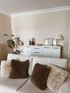
– Beige and Cream: Warm, neutral tones that provide a cozy and peaceful atmosphere.
– Lavender and Soft Purples: These bring a gentle, restful vibe without being too bold.
– Pale Pink and Peach: Subtle and comforting hues that add warmth without overwhelming.
Tips for Choosing Calm Colors for Your Home
1. Consider the Room’s Purpose
The function of the room should influence your color choice. For example:
– Bedrooms benefit from cool, soothing colors like light blue or soft green to promote relaxation.
– Living rooms often suit warm neutrals or gentle lavender for a welcoming, cozy feel.
– Home offices might use subtle greens or grays to foster focus without causing strain.
2. Start with a Base Color and Build Around It
Choose a calming base color for walls or larger surfaces, then add complementary shades through furniture, textiles, and décor. This layered approach keeps the space harmonious.
For example, if your base wall color is a soft beige, incorporate light gray or pale blue accents to add subtle interest while maintaining calmness.
3. Pay Attention to Natural Light
The amount and type of natural light a room receives can change how colors look. North-facing rooms usually have cooler light, so warm calm colors like beige or soft peach work well to counterbalance. South-facing rooms receive warm sunlight, making cool tones like pale blue or green feel even calmer.
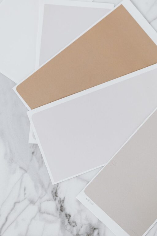
Test paint swatches on your walls and observe them at different times of day before committing.
4. Use Matte or Satin Finishes
Glossy or high-shine paint can feel too intense and might reflect too much light, disrupting the calm vibe. Matte or satin finishes soften colors and create a more subtle, soothing effect.
5. Incorporate Natural Elements
Combine calm colors with natural materials like wood, stone, or woven textiles to enhance the peaceful feeling. Earthy textures work beautifully with soft greens, blues, and neutrals.
6. Don’t Forget the Ceiling and Trim
Painting ceilings and trim in lighter or softer versions of your main color can unify the room without adding visual clutter. A crisp white ceiling with soft gray walls, for example, can feel fresh and calm.
7. Balance with Patterns and Texture
If you prefer some pattern, choose subtle and simple designs like thin stripes, small florals, or gentle geometric shapes in calm colors. Textured fabrics such as linen or cotton in muted shades add depth without overwhelming.
8. Limit Bold Accents
While calm colors dominate, you can incorporate small pops of richer colors like navy blue, dusty rose, or deep green through pillows, artwork, or decorative pieces. Keep these accents minimal to maintain the overall tranquil atmosphere.
Examples of Calm Color Palettes
Here are a few sample palettes to inspire your selection:
– Soft Blue and White: Light blue walls, white trim, and natural wood floors for a classic coastal feel.
– Muted Green and Warm Beige: Pale green walls combined with beige furniture and cream accessories create a nature-inspired space.
– Gray and Lavender: A delicate gray base with lavender accents adds understated elegance.
– Cream and Dusty Pink: Cream walls and dusty pink textiles for a cozy, feminine touch.
Final Thoughts
Choosing calm colors for your home is about creating an environment that feels balanced and welcoming to you. Take your time experimenting with different shades, finishes, and combinations. Remember that personal preference plays a big role—what feels calm and soothing to you may vary.
By considering the room’s function, lighting, and your own style, you can craft a tranquil space that supports relaxation and comfort every day. Happy decorating!